Comutr’s First Ride for Seed Stage Funding
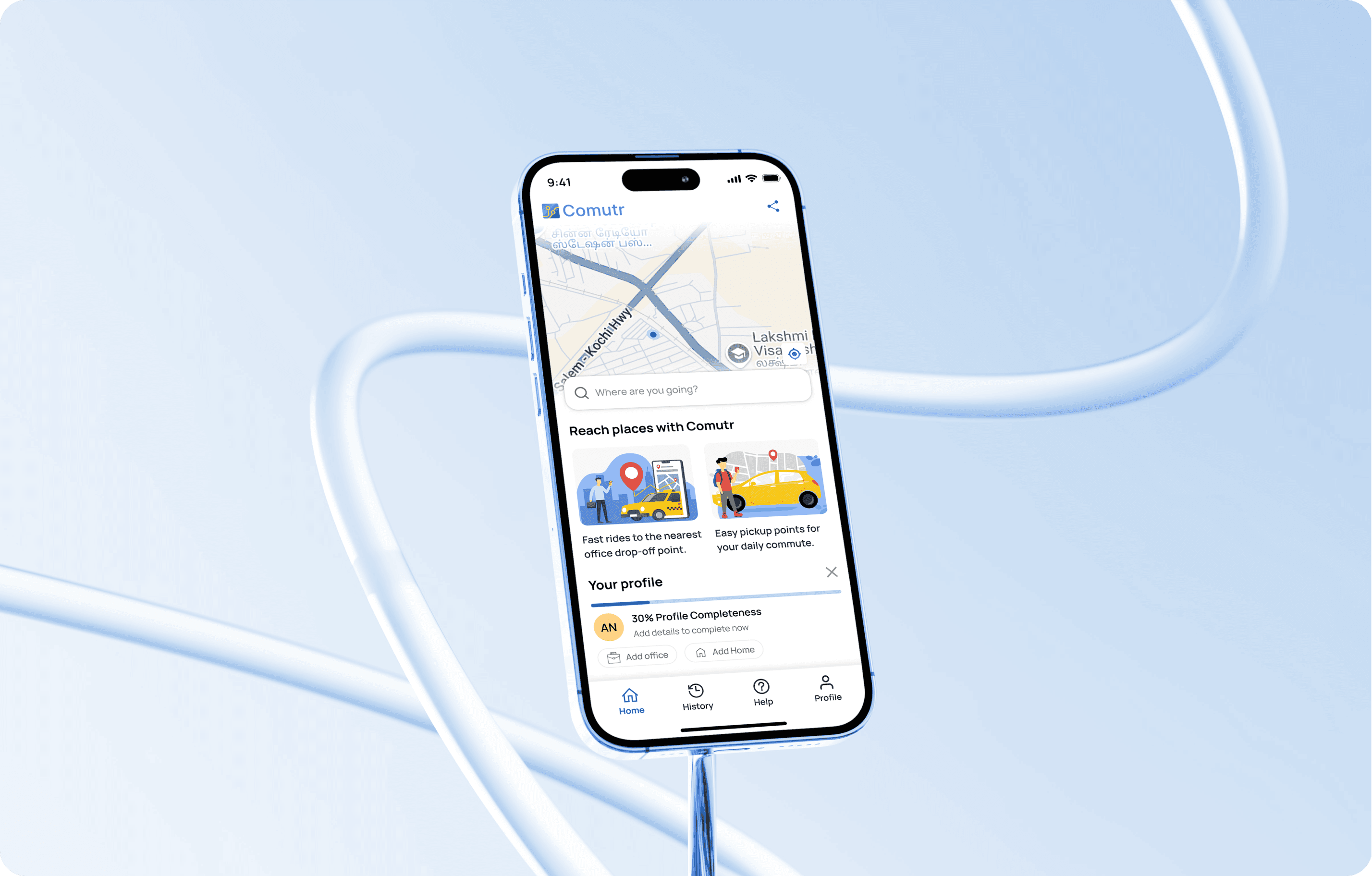
Designing from zero to funding a, UX strategy that validated commuter needs, convinced investors
and proved market fit product.

Designing from zero to funding a, UX strategy that validated commuter needs, convinced investors and proved market fit product.

Designing from zero to funding a, UX strategy that validated commuter needs, convinced investors
and proved market fit product.

MY ROLE: Product Designer

TIMELINE: Mar 2025- Sep 2025

PLATFORM: Mobile App IOS / Android

READING TIME: 14 Minutes

About Comutr
Comutr began as a solution to IT professionals' daily commute struggles multiple transfers, long travel times, and high costs. A 30-day proof-of-concept in Hyderabad's Hitech City validated a ride-pooling model that cut costs by 40-50% and optimized routes.

Comutr started by solving daily commute pain for IT professionals multiple transfers, long travel times, and high costs. A 30 day pilot in Hyderabad’s Hitech City validated pooled rides, reducing commute costs by 40–50% while optimising routes.

The platform evolved from WhatsApp coordinated carpools to a full-fledged mobile app with real-time booking, QR check-ins, and fixed-route optimization. Three apps Comutr (Passenger), Comutr (Driver), Admin panel .Built specifically for seed-stage funding and daily commuters, the app's strategic UX design and validated business model convinced investors, securing the capital needed to launch and scale across metro cities.

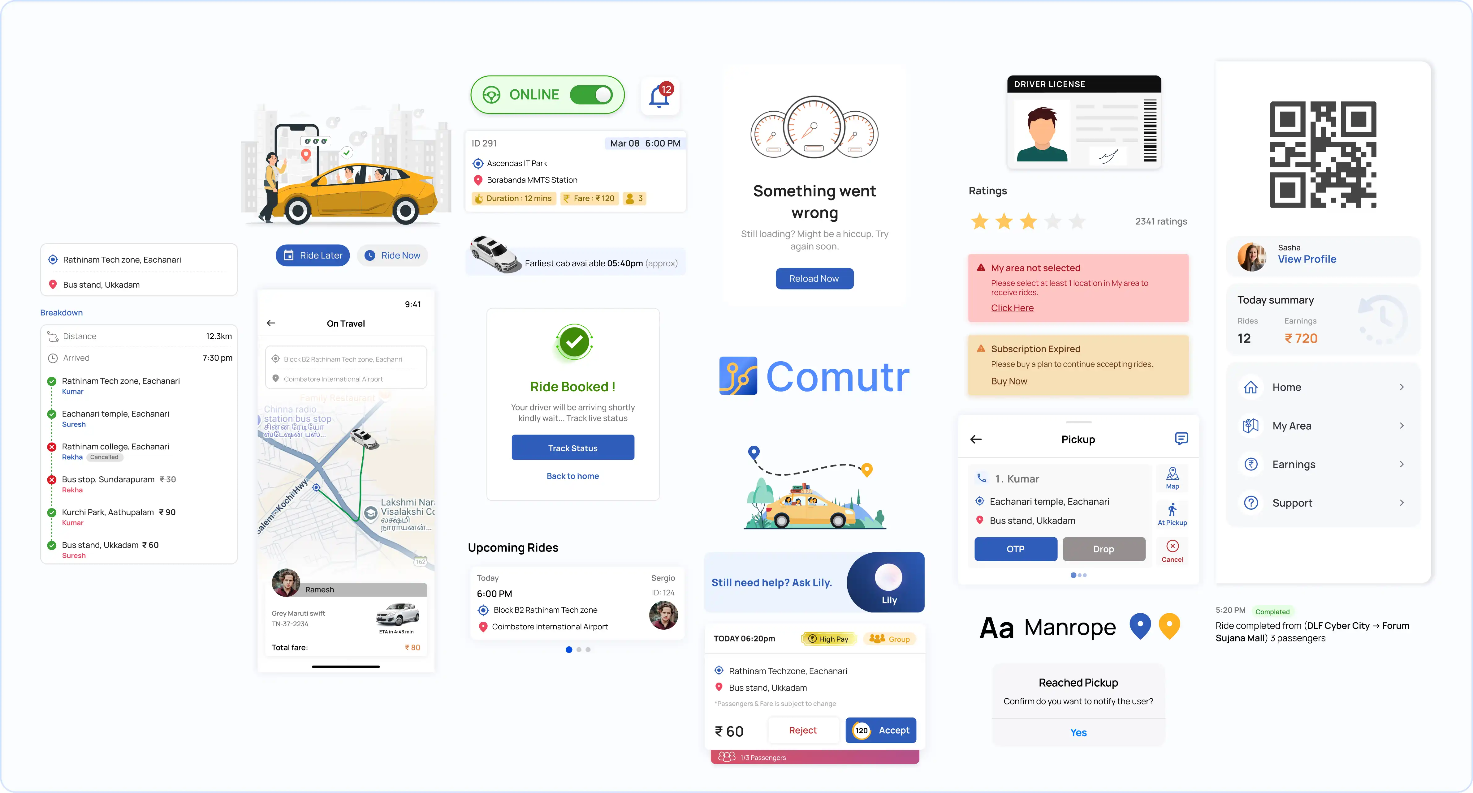
We evolved Comutr from WhatsApp carpools into a professional Passenger, Driver, and Admin ecosystem.

This strategic UX design secured seed funding, providing the capital needed to scale the platform across major metro cities.

A Glance

Kick-Off

1. Understanding Real Commuter Patterns
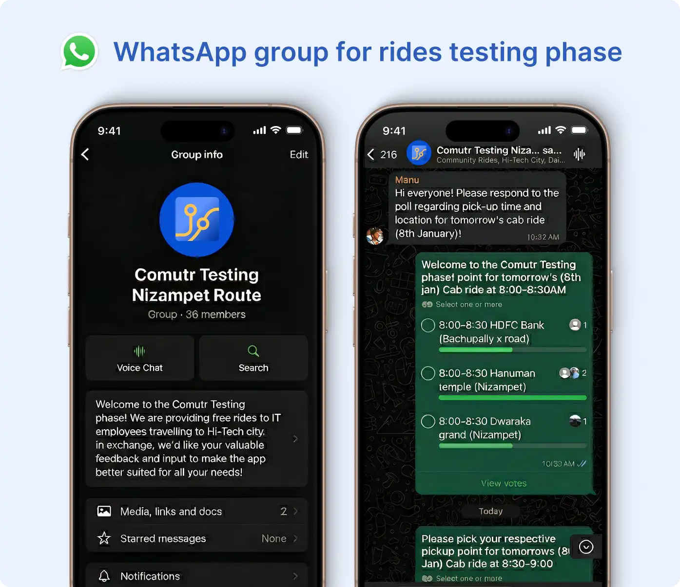
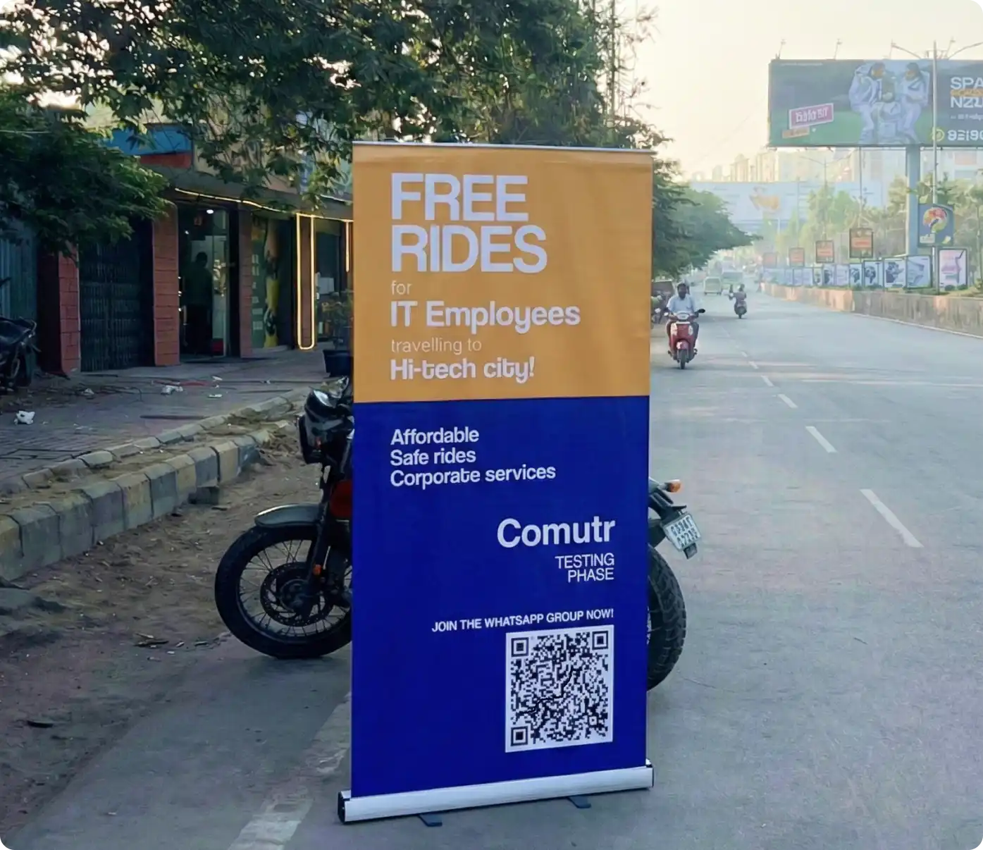
I kicked off the Comutr project by grounding myself in the real commuting patterns of office goers and students in metro cities. The client had already validated the core idea through multiple WhatsApp-based test runs announcing pickup and drop points, using polls to gauge demand, and coordinating shared rides manually. This early scrappy validation made one thing clear: there was a real need for pooled commuting, especially for people traveling daily to hubs like Hi-Tech city in Hyderabad.

Research focused on the daily patterns of office goers and students. We leveraged the client’s WhatsApp pilot data—using polls and manual ride coordination—to confirm high market demand.

This scrappy validation proved a clear need for pooled commuting, especially for travelers heading to major hubs like Hyderabad’s Hi-Tech City.

2. Looking at What People Already Love Using

From there, my first task was to translate this informal, community-driven system into a scalable digital experience. I studied the behavior patterns across leading mobility apps Uber, Lyft, Ola, Rapido, Namma Yatri, Red Taxi, BlaBlaCar, and QuickRide to understand what users already expect from ride-hailing interfaces. Since people are heavily conditioned to these established mental models, introducing a radically new UI would only create unnecessary friction for a bootstrapped product in world of dominant players.

The challenge was scaling an informal carpool system into a product. By studying familiar ride-hailing apps, I aligned Comutr with existing mental models avoiding unnecessary friction in a competitive, bootstrapped environment.

3. Making the App Feel Easy From Day One

So I anchored the design direction on familiar interaction patterns, while adapting the flows to support grouped commutes, area-based pooling, and predictable pick-up routes. The goal wasn’t just to design a new app it was to craft a solution that felt instantly usable, while solving a commuter problem that existing platforms hadn’t addressed well.

I prioritized familiar interaction patterns for instant usability, adapting them for grouped commutes and area-based pooling.

This strategy addressed the specific commuter gaps that existing market leaders often overlook.

Features That Reflect How People Actually Travel

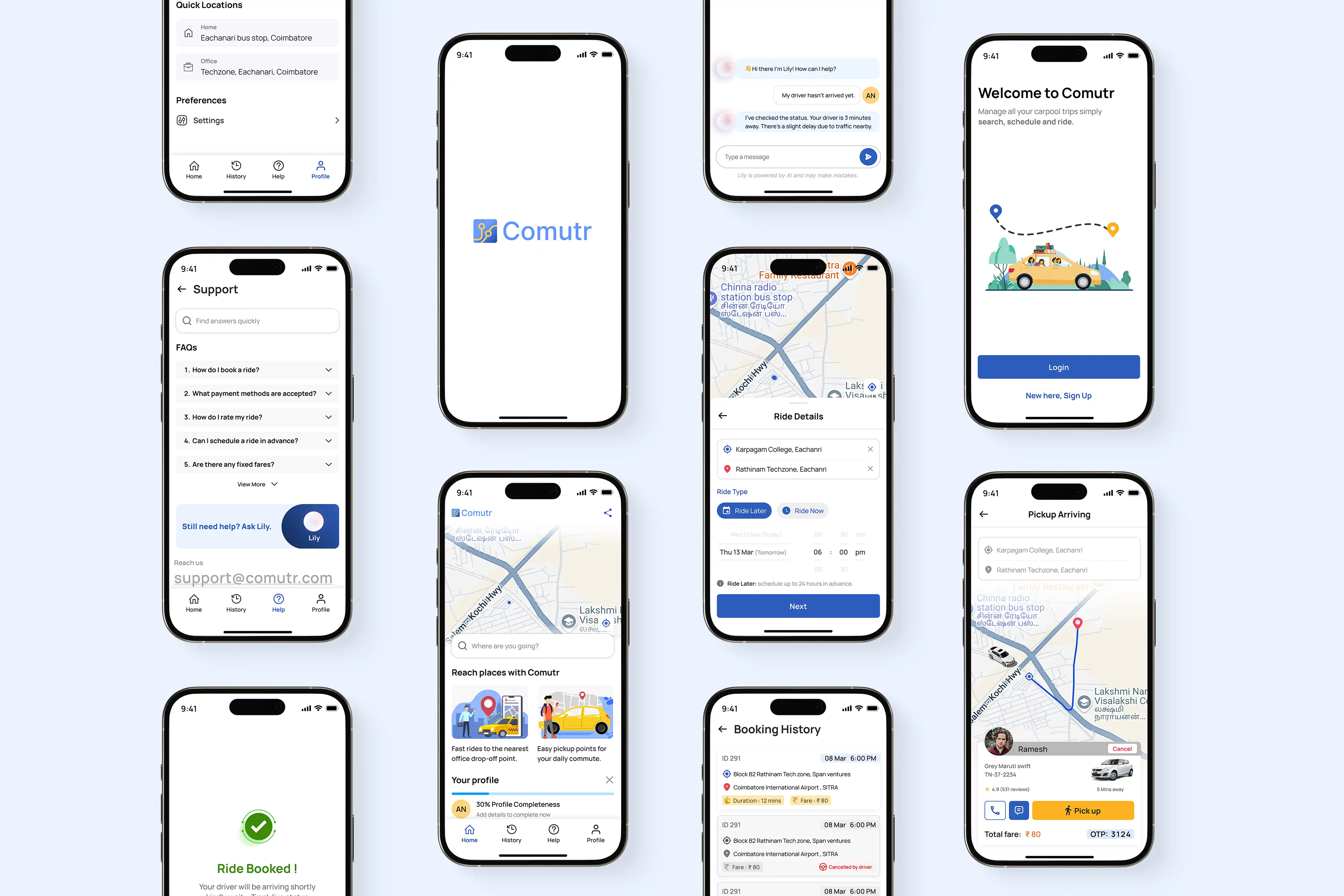
We designed Comutr around how people actually travel short distances, fixed destinations, and predictable office hours. Each feature here streamlines the daily grind with pooled rides, smart routing, and a flow that feels familiar from day one.

Passenger Application (Comutr)
1. Ride Later
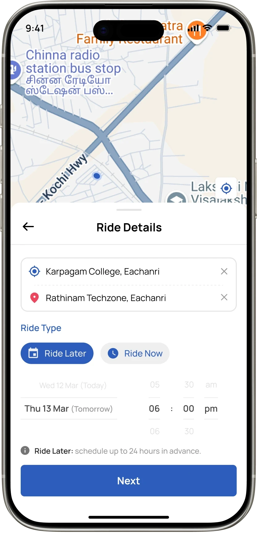
Comutr lets users book in advance with Ride Later and automatically groups them with others heading to the same pickup and drop-off area within a similar time window. This time-based pooling sets it apart—while other apps only schedule rides, Comutr smartly clubs commuters on the same route for a shared, lower-cost trip.

With Ride Later, commuters booking similar routes and times are grouped automatically turning scheduled rides into smarter, lower-cost shared trips.

2. Pickup

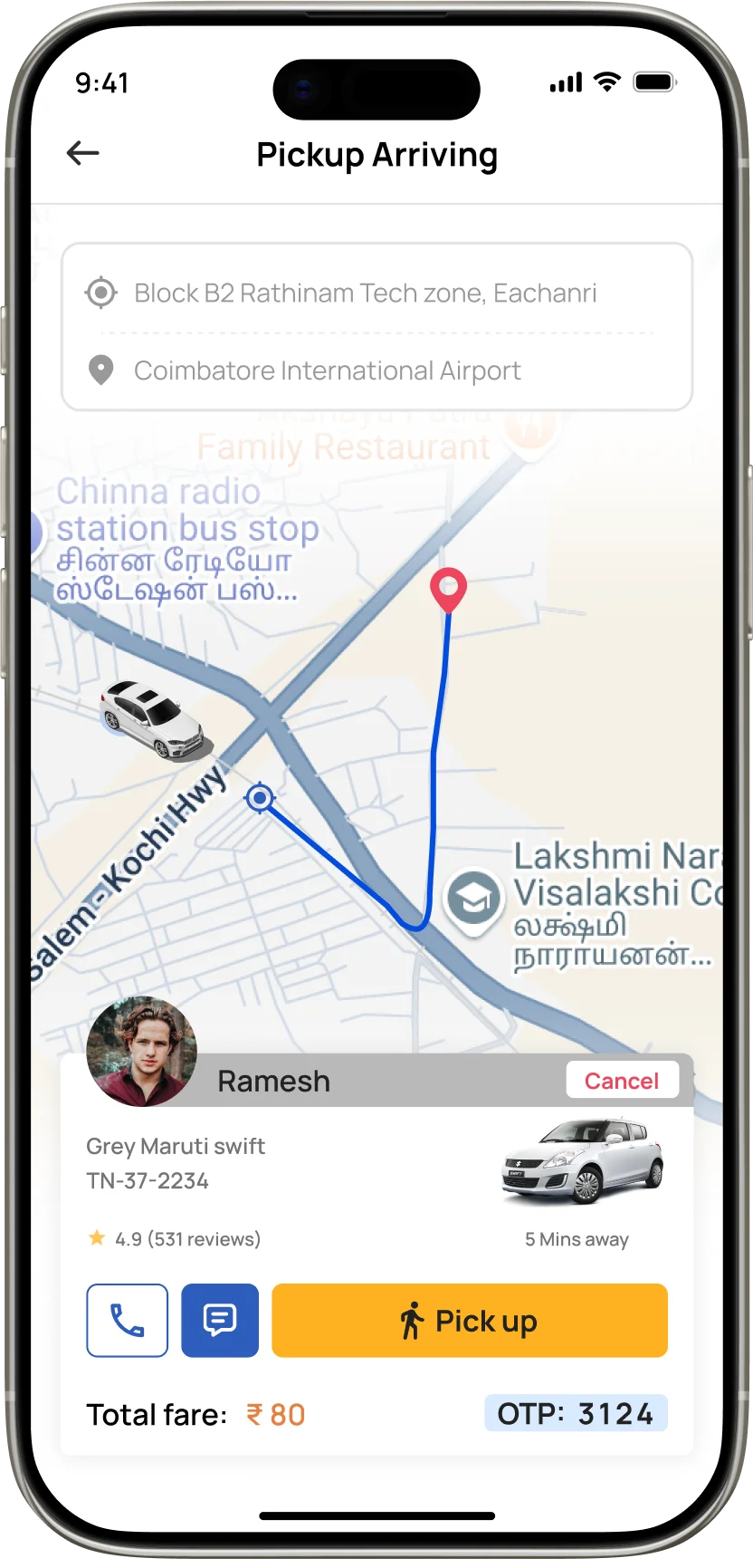
Pickup helps users navigate to their pickup spot from their current location using their maps app. Once the driver starts the ride, passengers instantly receive a notification reminding them to head to the pickup point.

Pickup guides users to their pickup point using their preferred maps app. When the driver starts the ride, passengers get a timely reminder to head to the pickup spot.

3. Chat

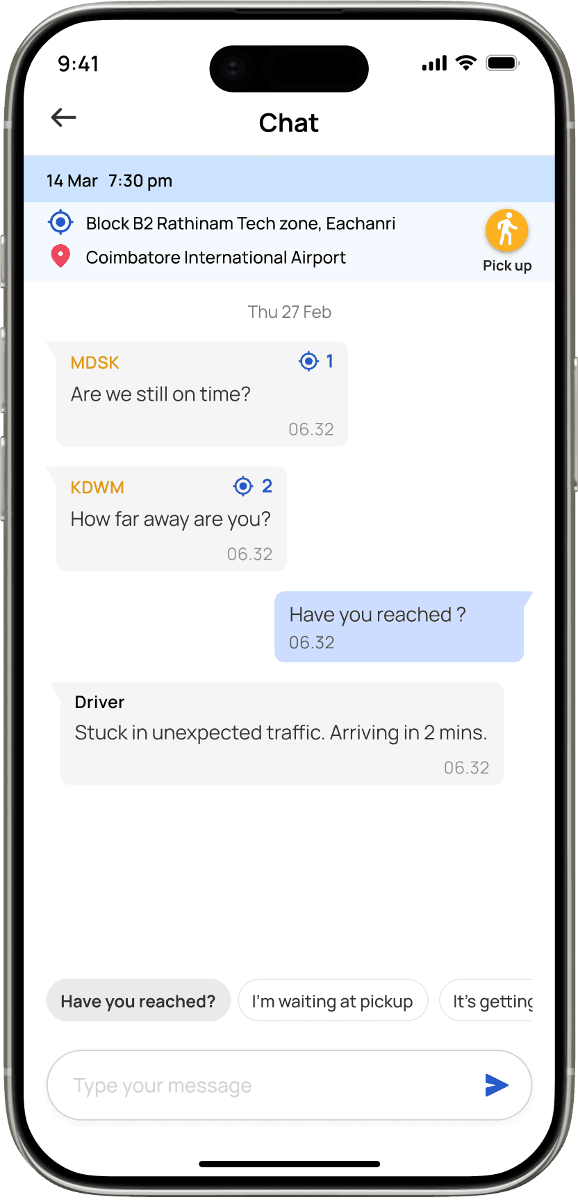
Chat lets passengers communicate with each other and with the driver during the ride. Messages are auto-deleted once the trip ends for privacy. Each passenger gets a unique alias so their real names stay hidden from others, visible only to the driver if needed. Quick-reply chips make common messages faster, and users can also navigate to the pickup point directly from here.

Chat enables quick communication with passengers and the driver. Messages auto-delete after the trip, aliases protect identities, and quick replies make coordination faster.

4. Support, Powered by Lily

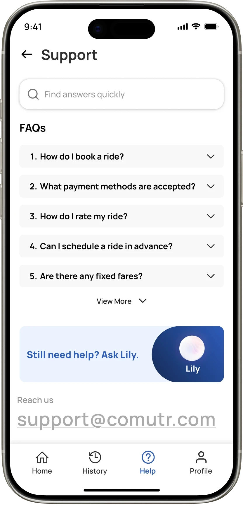
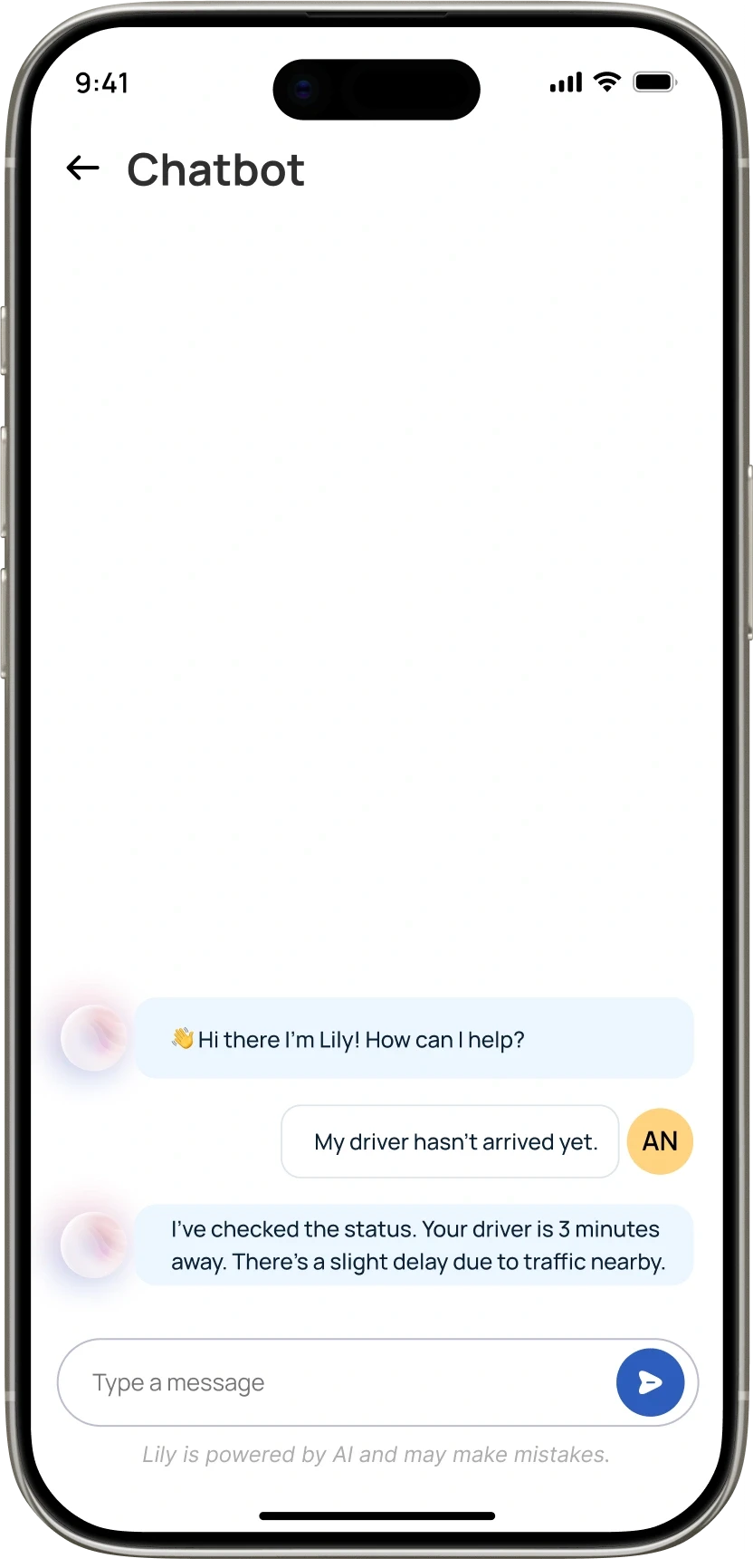
A lightweight support system that mixes FAQs for quick answers and Lily, an AI chatbot that handles more detailed questions in real time. Fast, simple, and built around rider needs.

A lightweight support system that mixes FAQs for quick answers and Lily, an AI chatbot that handles more detailed questions in real time. Fast, simple, and built around passenger needs.

5. Account Control

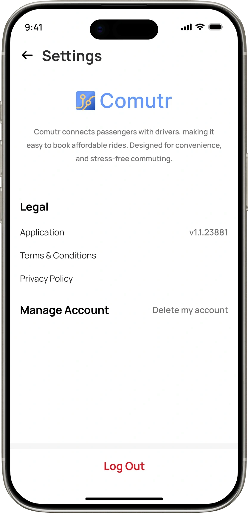
Users have full control over their data, including the option to delete their account whenever they choose. This gives riders transparency and autonomy, aligning with privacy-first design principles.

Users have full control over their data, including the option to delete their account whenever they choose. This gives passengers transparency and autonomy, aligning with privacy-first design principles.

6. Home & Office points

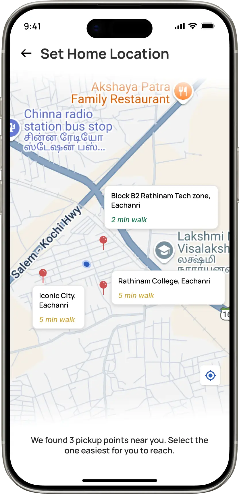
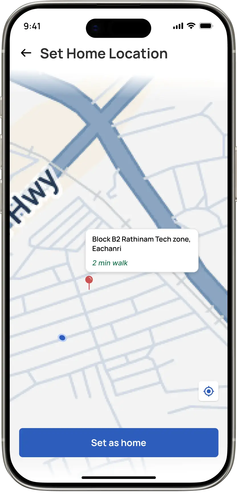
Comutr lets passengers save the nearest pickup point to their Home and Office. With these shortcuts set, booking becomes faster just tap Home or Office and go.


Provided the walk duration reduced cognitive load in selection of a point

Passengers can save Home and Office pickup points for instant, one-tap booking from their most frequent locations.

Displaying the walk duration for each point reduces cognitive load, helping users make faster and more informed selections.

Driver Application (Comutr Partner)

1. Optimized Ride Acceptance
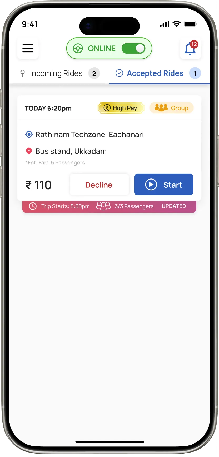
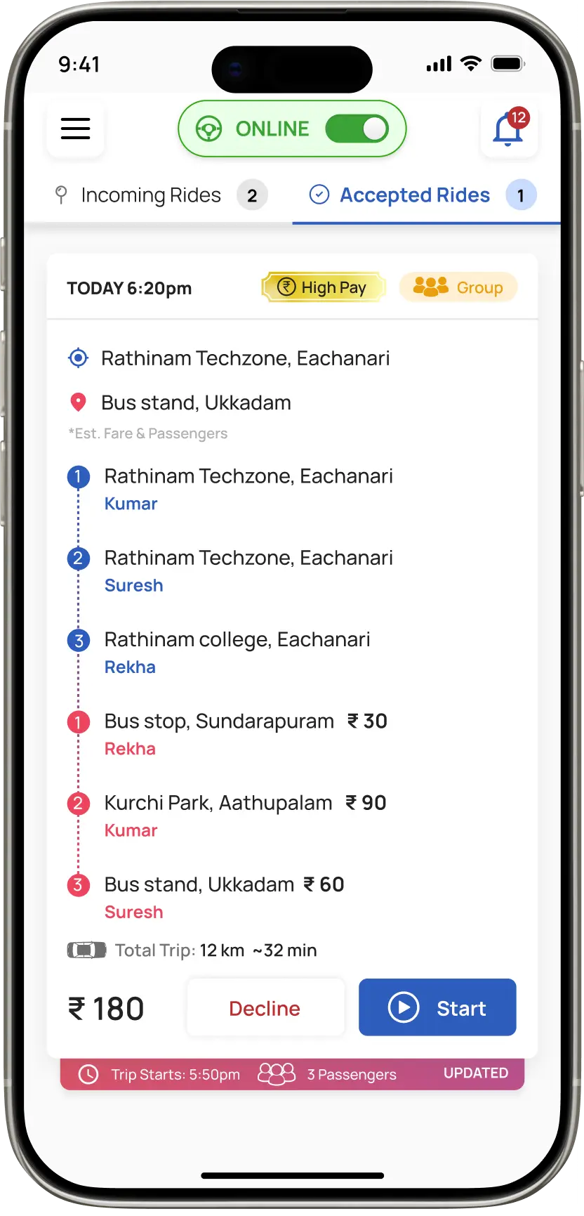
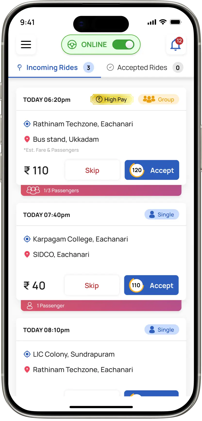
This card design went through multiple iterations since group rides are more profitable for drivers and are mostly booked through Ride Later. Once a ride is accepted, it moves to the Accepted Rides tab. Tapping the card shows all pickup and drop-off points, ordered from nearest to farthest based on the driver’s location.


The “Starts at” label indicates the buffer time before the ride begins, and once started, passengers receive a notification to be ready at their pickup point.

We iterated the card design to prioritize high-profit group rides and scheduled bookings.

Accepted trips auto-organize all stops based on nearest-to-farthest proximity to the driver.

The "Starts at" label and automated alerts ensure passengers are ready exactly when the trip begins.

2. Priority Zone Selection

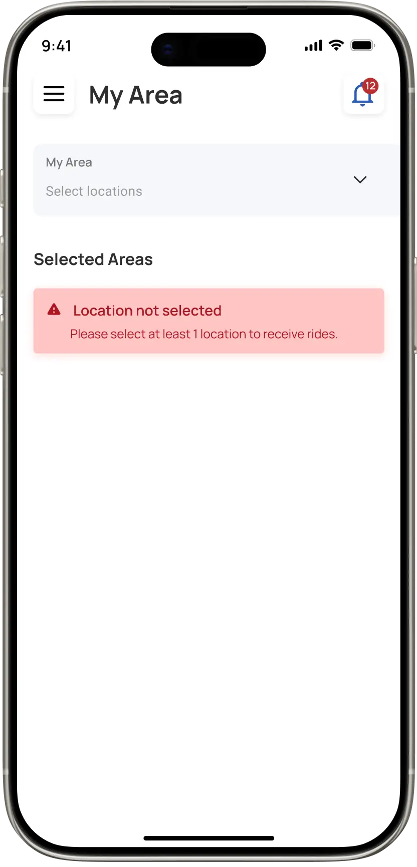
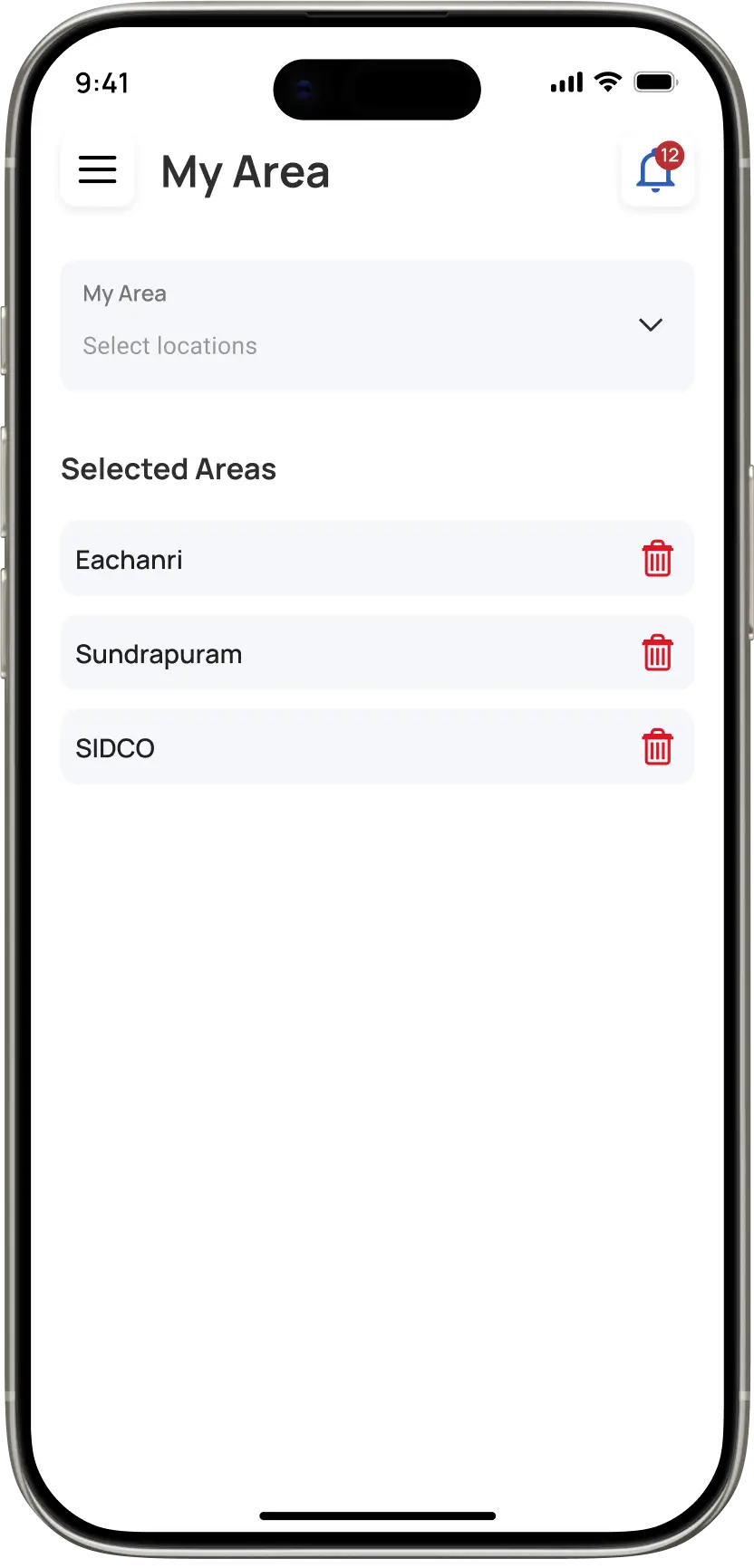
To improve driver satisfaction and retention, we moved away from blind dispatching. The “My Area” feature allows drivers to geo-fence their preferred working zones (e.g., near their home or high-traffic hubs).

The allocation algorithm prioritizes these drivers for rides originating in these zones, ensuring they work where they feel most comfortable and profitable.

We replaced blind dispatching with "My Area" geo-fencing, allowing drivers to set preferred work zones near home or high-traffic hubs.

The allocation algorithm prioritizes drivers for rides in these specific zones to maximize their comfort and profitability.

3. Passengers Pickup

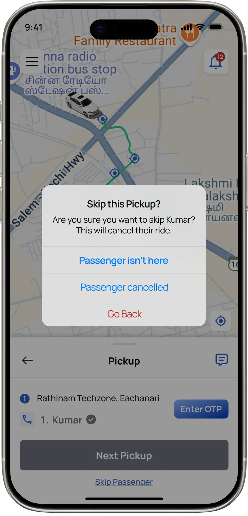
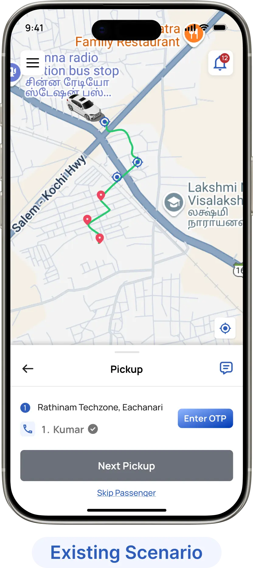
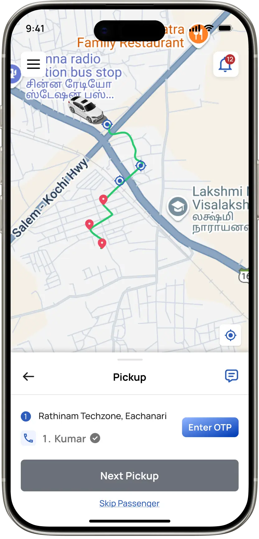
Since real-world pickups can be unpredictable, OTP verification remains mandatory to start a ride, preventing unverified boardings. But to avoid blocking drivers when a passenger doesn’t show up, we added a separate “Skip Passenger” flow. This lets drivers skip a missing rider and continue to the next stop without any delay or friction. Messages can also be accessed anytime through the chat icon.

Because real-world pickups can be unpredictable, OTP verification is required to start a ride and prevent unverified boarding. To avoid blocking drivers when a passenger does not show up, a separate Skip Passenger flow allows them to continue to the next stop without delay. Chat remain accessible at any time through the chat icon

4. Distraction-Free Interface

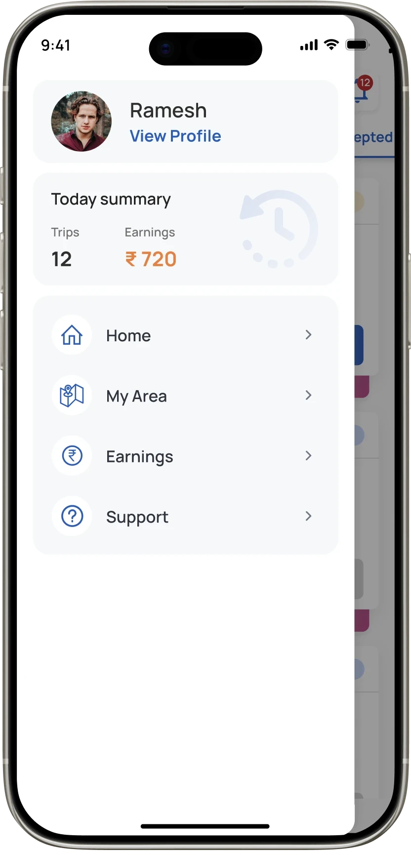
To maximize the map area for navigation, we replaced the traditional bottom bar with a slide-out drawer. This keeps the primary interface clutter-free, reducing cognitive load while driving.

Secondary tasks like checking earnings or changing zones are housed here, ensuring they are only accessed when the driver is ready to switch context, not while navigating a route.

To maximize map real estate, we replaced the bottom bar with a slide-out drawer. This reduces cognitive load, helping drivers focus on the road instead of interface clutter.

Secondary tasks are tucked away to ensure they are only accessed during context switches, preventing dangerous distractions while navigating a route.

Reducing the Cognitive Cost of Commuting

True cognitive ease isn't achieved in isolation; it requires a synchronized ecosystem. I approached Comutr as a unified network where Passenger demand, Driver supply, and Admin oversight operate in perfect equilibrium.

I orchestrated these three platforms to communicate in real-time instantly translating a passenger’s booking request into a driver’s optimized route and an admin’s live metric. This seamless data feedback loop ensures that while the backend logic is complex, the experience for every stakeholder remains fluid and friction-free.

I designed Comutr to keep riders, drivers, and admins working together in real-time. This ensures everyone stays in sync throughout the daily commute.

By linking these three roles, I turned a complex engine into a simple, reliable experience for every user.

The 30-Second Booking Blueprint for passengers

Time is the primary constraint. I designed for velocity by flattening the information architecture, reducing the Interaction Cost to its absolute minimum. By surfacing high-frequency actions immediately, the system ensures a ride can be secured in under 3 taps.
The cognitive tunneling protocol for driving
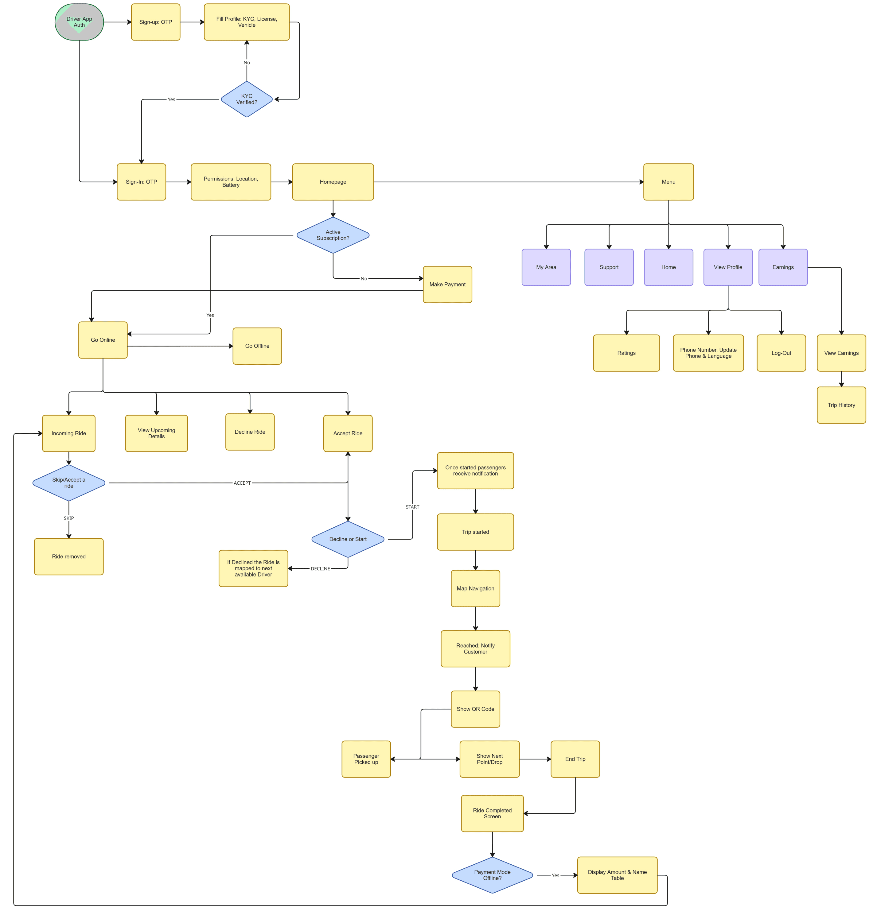
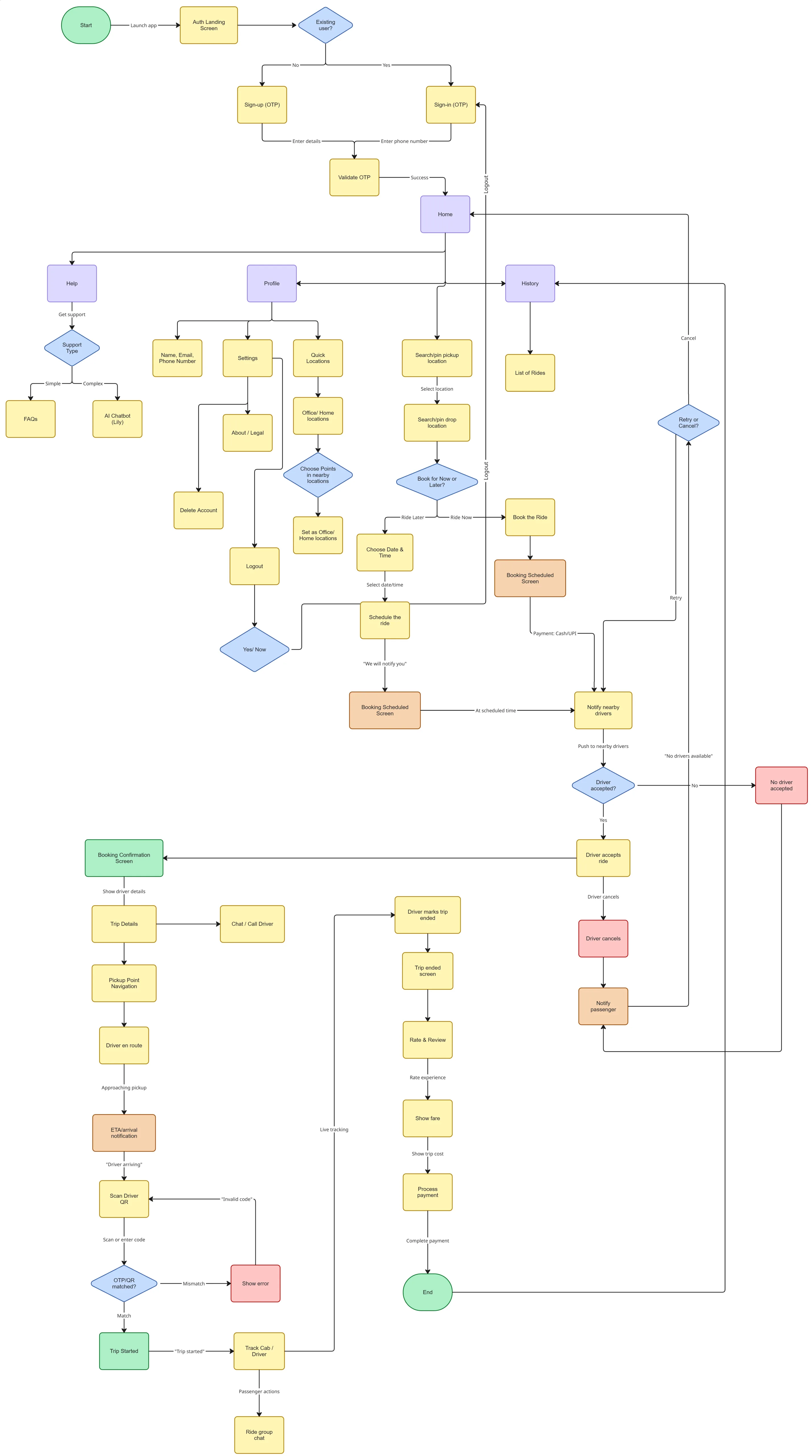
I architected the driver's workflow using Cognitive Tunneling principles. Once 'Online,' the system minimizes context switching by serializing complex logistics into atomic, actionable steps. The flow enforces a strict linear path Accept → Navigate → Verify (QR) → Drop. This constrained architecture removes ambiguity, ensuring that at any given moment, the driver is presented with a single primary action, eliminating decision fatigue.

I architected the driver's workflow using Cognitive Tunneling principles. The flow enforces a strict linear path Accept → Navigate → Verify (QR) → Drop. This constrained architecture removes ambiguity.

Visualizing the Operational Logic

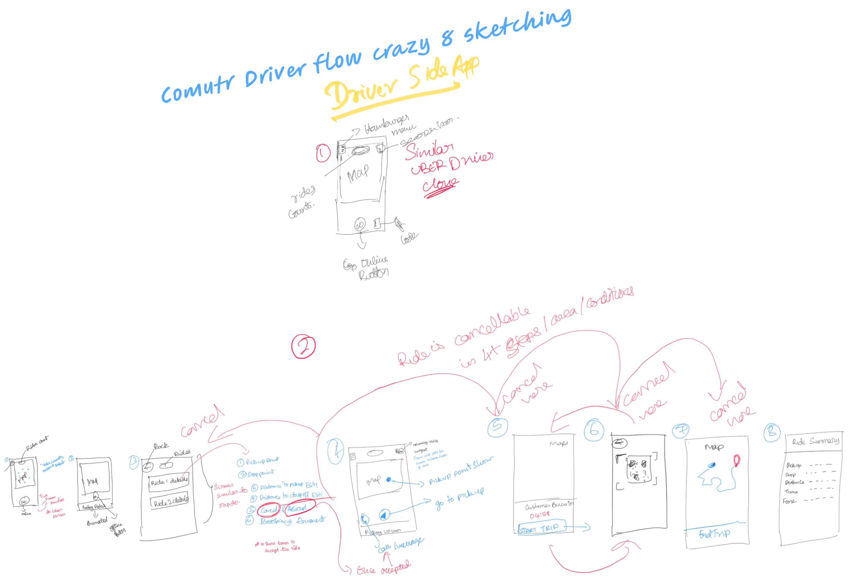
Complex flows often hide structural flaws that high-fidelity design obscures. I used rapid hand-sketching to stress-test the driver’s 'Happy Path' against critical edge cases—like cancellations and network errors. This low-fidelity exploration allowed me to validate the linear progression of the ride lifecycle, ensuring the logic held up before a single pixel was polished.

The operational control plane of admin
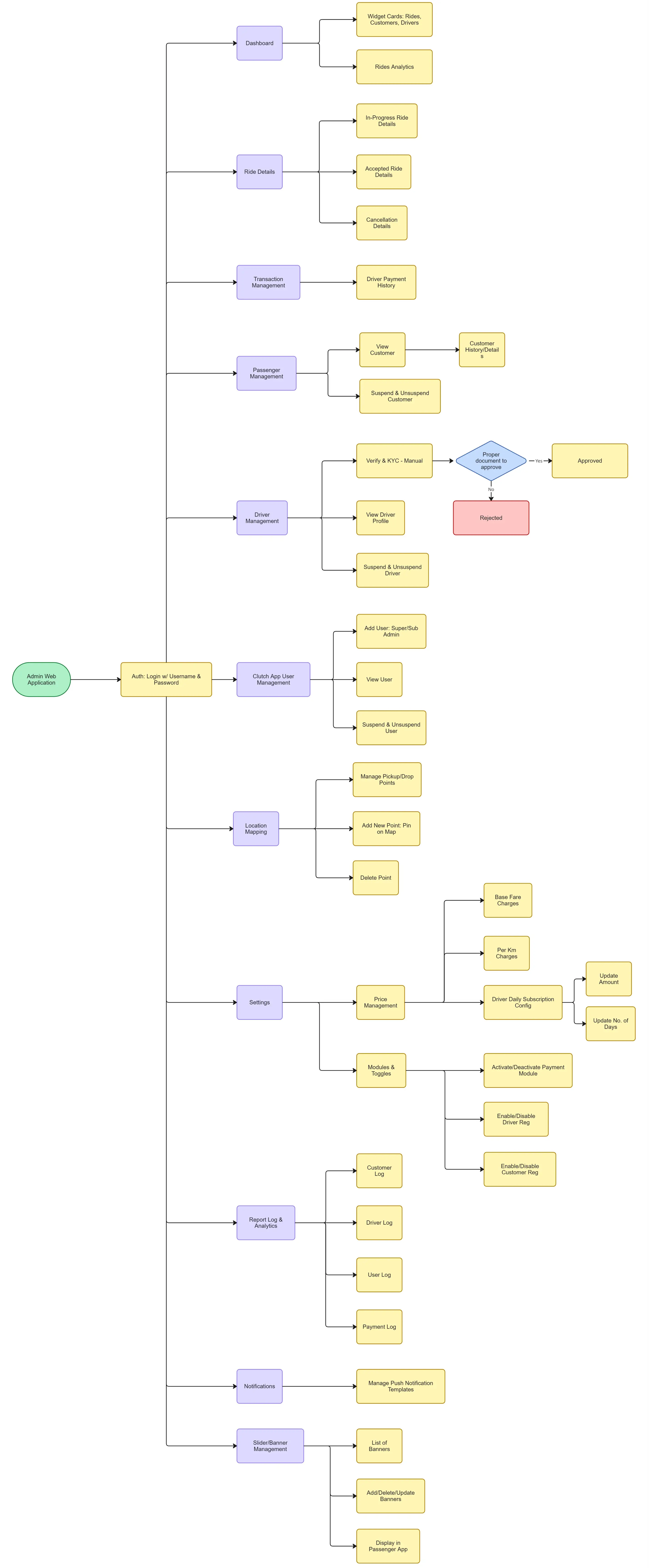
Consumer apps are brittle without a configurable backend. I designed the admin architecture to minimize Operational Latency. Instead of relying on engineering tickets to update business rules, I exposed critical parameters like Price management, Location mapping directly in the UI. This shifts the admin’s role from passive reporting to active system configuration, allowing the operations team to resolve marketplace imbalances in real-time without code deployments.

Identifying the Urban Mobility Gap

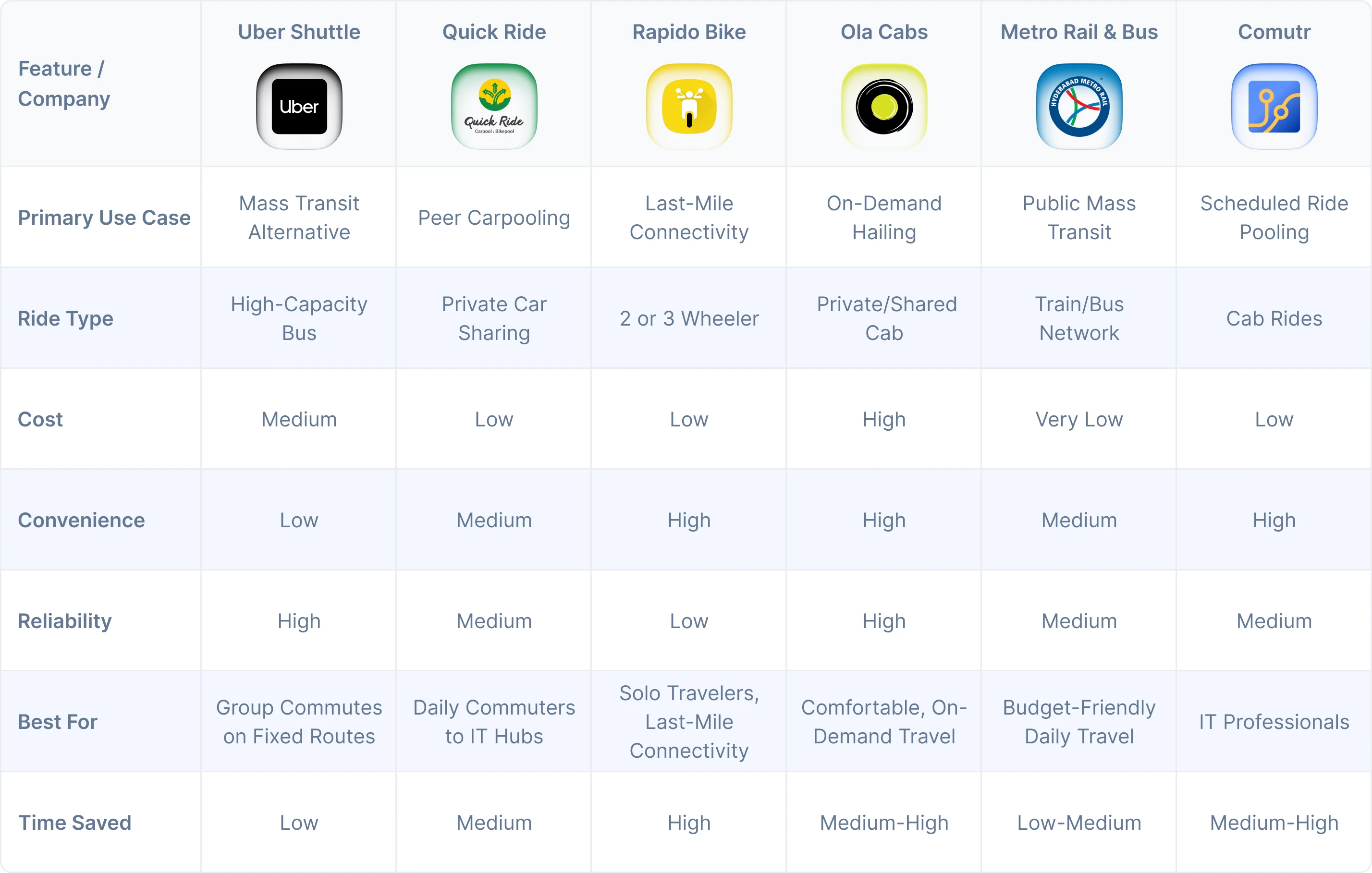
Current solutions force a binary trade-off: high-cost privacy (Cabs) or low-cost discomfort (Mass Transit). My competitive market analysis revealed a critical 'missing middle': professionals who need the reliability of a fixed route with the comfort of a car, without the premium price tag.
Designing for Device Diversity

Given the demographic landscape of Indian commuters, prioritizing Android's diverse ecosystem was a strategic necessity. I architected a flexible design that shares core logic while respecting platform-specific heuristics.

By adapting key components like navigation patterns and selection controls to align with iOS Human Interface Guidelines and Material Design 3, I ensured that Comutr feels native on every device. This strategy helps reduce friction often found in cross platform apps, ensuring the interaction model feels familiar to the user regardless of their OS.

Validating Interaction Patterns with testing

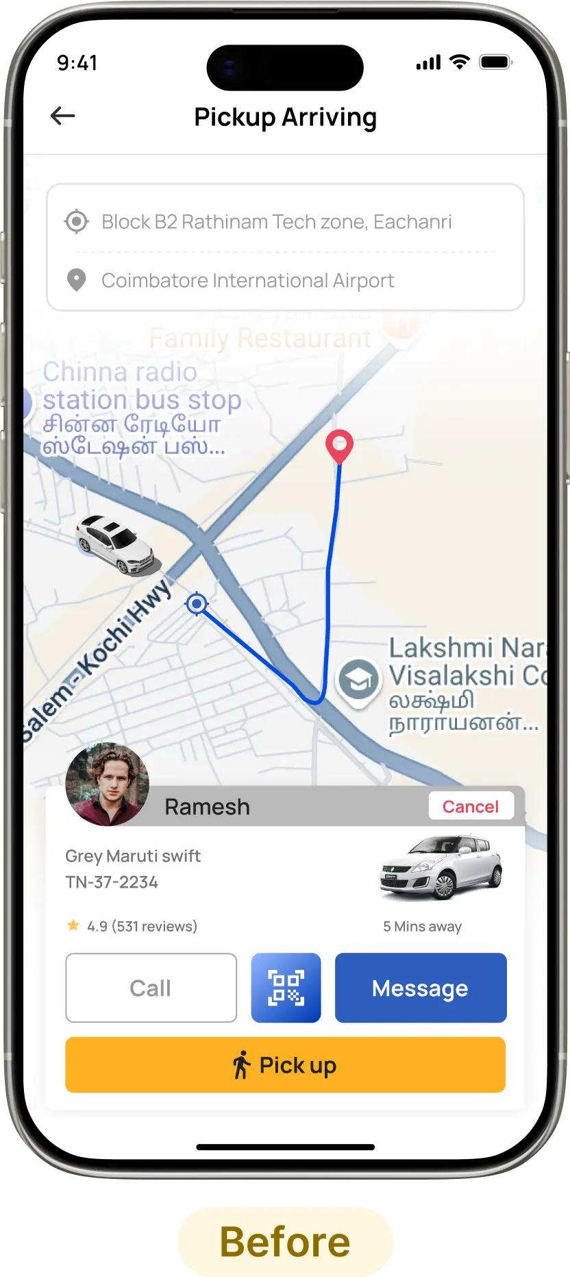
We didn't just test for software bugs; we tested for situational friction. By conducting pilot runs in real-world conditions (low light, moving traffic, time pressure), we identified critical failure points in the boarding experience that standard lab testing missed.

1. Optimizing the Boarding Handshake

The Hypothesis: We initially prioritized QR scanning for maximum ease of use.

The Reality: Field testing revealed high interaction cost. Passengers struggled to align cameras in low-light conditions or while the vehicle was in motion, causing significant boarding delays.

The Pivot: We switched to a 4-digit PIN (OTP) model. This passive verification method reduced the physical effort required, resulting in a 40% faster boarding time without compromising safety.
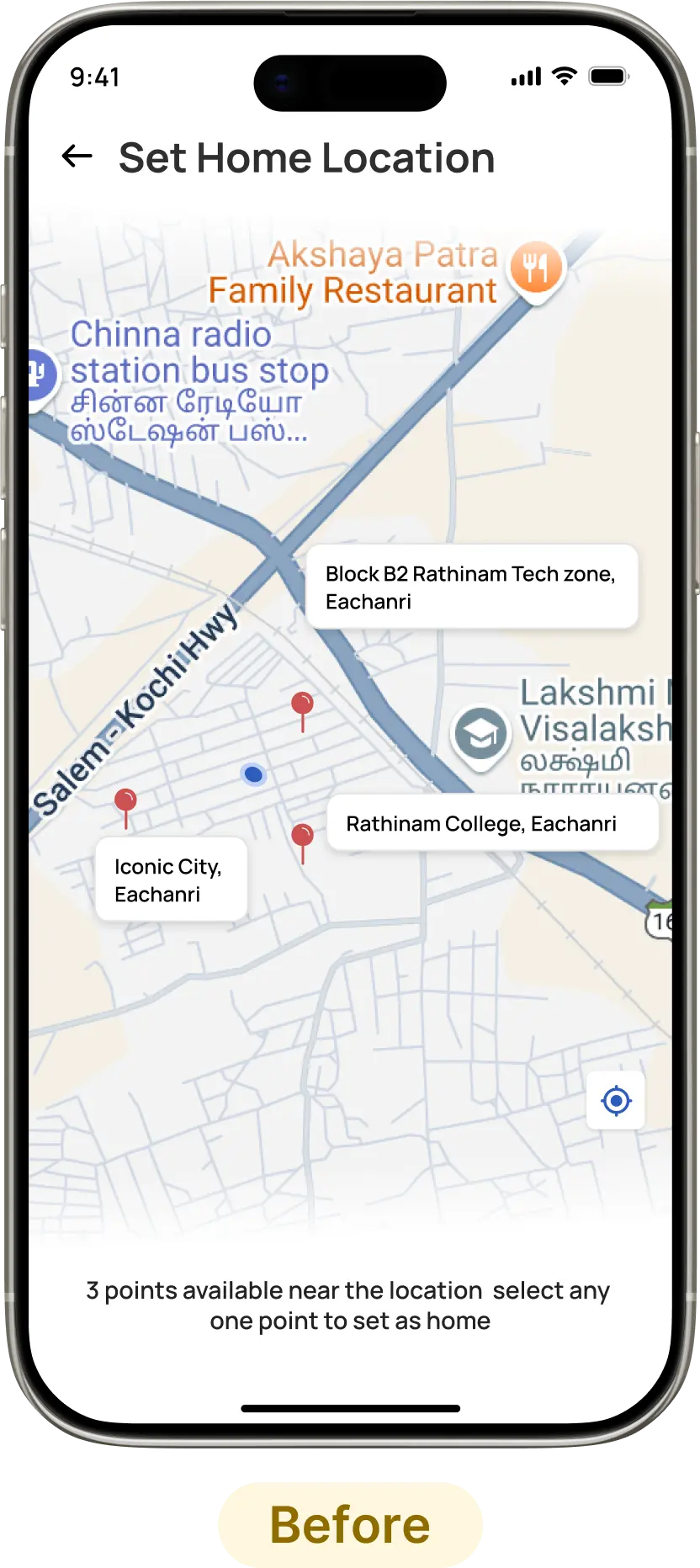
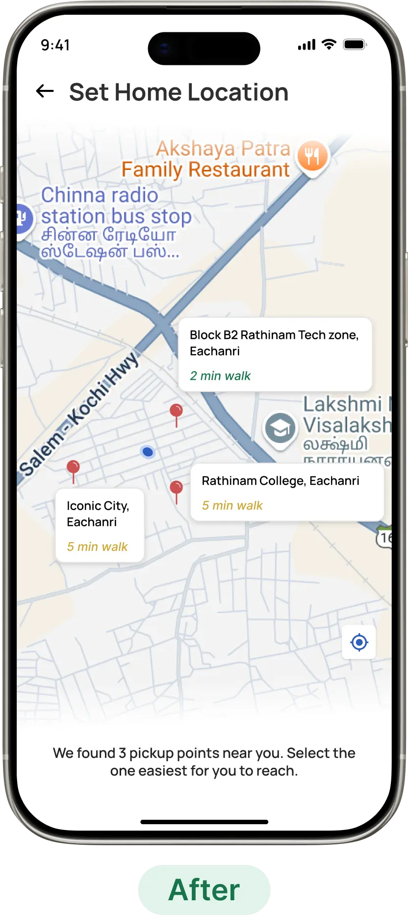
2. Reducing "First-Mile" Anxiety

The Hypothesis: We assumed users could visually estimate walking distances on the map to select their nearest pickup point.

The Reality: User testing revealed Decision Paralysis. Users hesitated to select a point because map proximity doesn't always equal accessibility. They were anxious about selecting a point that looked close but might actually be a difficult 10-minute walk.

The Pivot: We introduced Proximity Heuristics. By explicitly calculating walking duration (2 min walk) and using semantic color-coding (Green for easy, Yellow for moderate), we shifted the user's mental model from guessing distance to knowing effort, increasing selection confidence.
3. Clarifying the "Effort-to-Value" Ratio

The Hypothesis (Versions 1 & 2): We initially tested a text-heavy list view (V1), assuming drivers needed raw data to make decisions.

The Reality: Testing revealed critical friction points. Text heavy layout caused Information Overload, forcing drivers to read while driving. The Reject button in V2 introduced negative cognitive load drivers hesitated to press it.

The Pivot (Implemented V3): Based on these insights, we shipped Version 3 with two key architectural shifts:

Semantic Value Tags: We introduced High Pay, Group and Single badges. This allows drivers to assess ROI in milliseconds via peripheral vision.

Neutral Microcopy: We replaced Reject with Skip. This simple semantic shift reframed the action from a Penalty to a Choice, significantly reducing decision fatigue and improving acceptance rates.
4. Driver pickup flow: flexibility over algorithmic rigidity

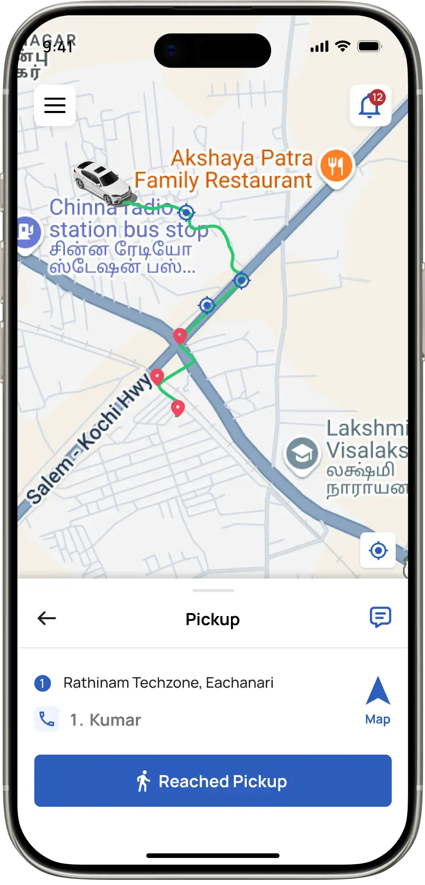
The Hypothesis: We initially engineered that drivers should follow a fixed pickup order (1st → 2nd → 3rd) based on algorithmic distance sorting. This seemed logical for efficiency and routing consistency.

The Reality: Beta testing revealed that rigid, algorithm based pickup sequences which in first place was to help them to optimize the ride (1st → 2nd → 3rd) but locked drivers into inefficient routes due to backend logics. If the first passenger was furthest away, drivers wasted time and fuel.

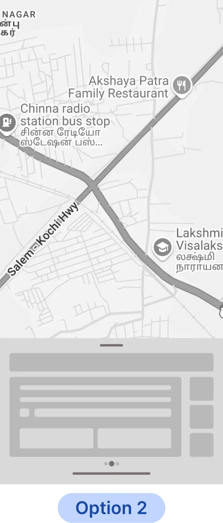
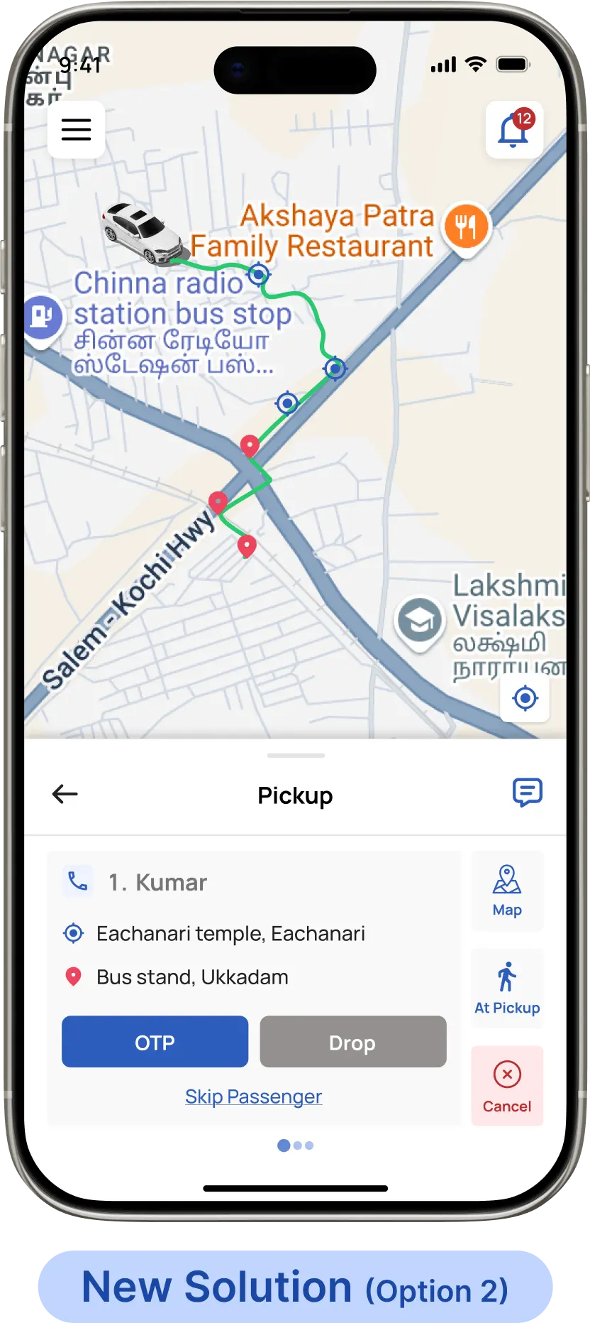
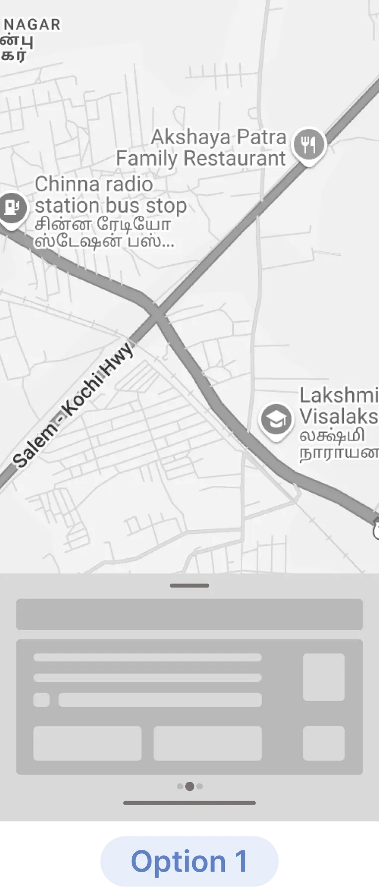
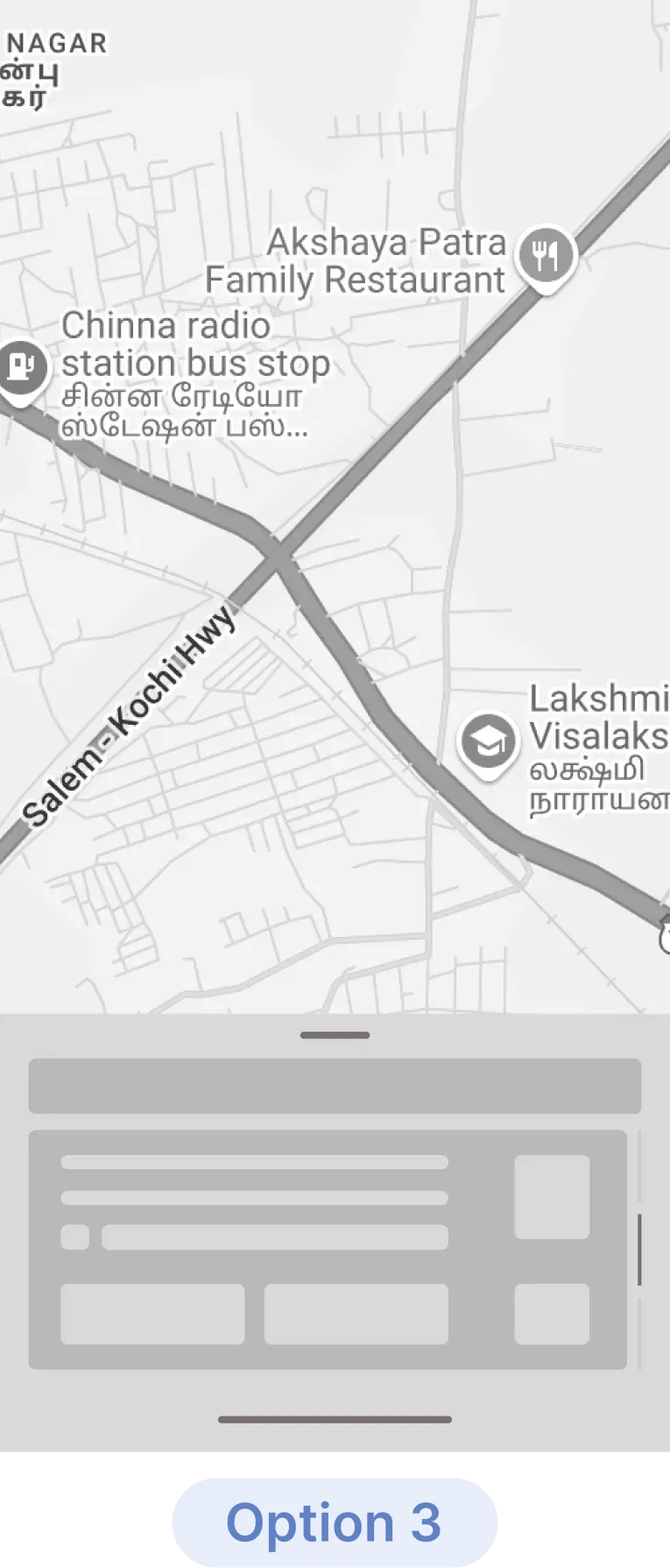
The Pivot: We re-engineered the passenger card as a horizontal slider, giving drivers the freedom to start the ride from the nearest available passenger not just the algorithm’s fixed order.

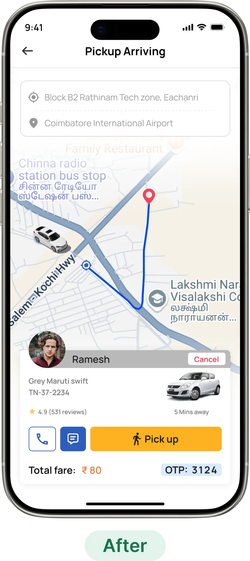
Option 2 emerged the best solution here that allowed route optimization to begin after onboarding the first passenger, not before it.


Post-pilot testing confirmed this solved the bottleneck, improving driver satisfaction and ride efficiency.
Future Scalability & Product Roadmap

The MVP focused on the core objective of getting a ride. Our Phase 2 roadmap shifts focus to ecosystem longevity. As Comutr grows, the next phase of the roadmap focuses on deepening trust, improving ride safety, and creating more value for both passengers and drivers. These upcoming features are designed to enhance the overall commuting experience while supporting operational efficiency and user retention.

Wallet

A seamless in-app payment option to reduce cash dependency and enable smoother, faster ride completion.

Reward System

A points-based loyalty program that encourages consistent usage and rewards long-term commuters and high-performing drivers.

Emergency Contact / SOS

A safety-first feature allowing passengers to quickly alert trusted contacts or emergency services during unexpected situations.

Speed Monitoring

Real-time monitoring to ensure safe driving behavior, improving passenger comfort and reducing operational risk.

Idle Time Alert

Alerts for prolonged idle time help drivers stay efficient, reduce fuel waste, and maintain smoother pickup cycles.

The engine room behind Comutr

Building a three-sided marketplace required high-velocity collaboration. We operated like a synchronized pit crew, where UX strategy served as the blueprint for Engineering and QA.

Instead of working in silos, we maintained tight feedback loops to ensure technical implementation and design flows never compromised the user journey. We were united by a singular obsession: translating the complex chaos of urban logistics into a seamless, human-centric experience.


We didn't just build an another app; we engineered the 'missing middle' of urban mobility, turning chaotic logistics into a dignified daily journey.